.png)
- Skip to SectionOverview
- Lesson Preview
- Teaching Materials
- Feedback
- Extensions
- Background
- Standards
- Credits
- Acknowledgments
- Overview
- Lesson Preview
- Teaching Materials
- Feedback
- Extensions
- Background
- Standards
- Credits
- Acknowledgments
I Like That!
How perception, emotion, and cognition shape our preferences
.png&w=3840&q=75)
Sponsored by:
The Gist:
Students will conduct experiments and analyze real scientific data as they learn about themselves. They'll learn how our eyes and brains interact to determine what we like and dislike, and apply this knowledge to fish research and the art of character design.
Target Subject:
Grades:
Estimated Time:
Target Subject:
ScienceGrades:
5-9Estimated Time:


Subject breakdown by standard alignments
Driving Question(s):
- What makes humans and other animals perceive something as beautiful?
- How does the way our brain processes visual input from our eyes affect how we perceive and interact with the world?
Essential Question(s):
How can science help deepen our understanding of the Arts, Humanities, and ourselves?
Hook(s):
Warm-up puzzles, fun student-driven experiments, and original artwork are woven into this data-centered lesson.
Keywords:
animal behaviorthe sensesvisionfisharthistogramboxplotdata literacyTrailer: I Like That!
Trailer giving an overview of what this lesson entails.
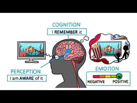
I Like That! How our eyes and brains interact to determine what we like and dislike
Sets up an experiment students will run on themselves to understand how emotion, memory, and higher-order connections explain their own preferences.
Images for Part 1 Experiment
Visual stimuli for the experiment students will run.
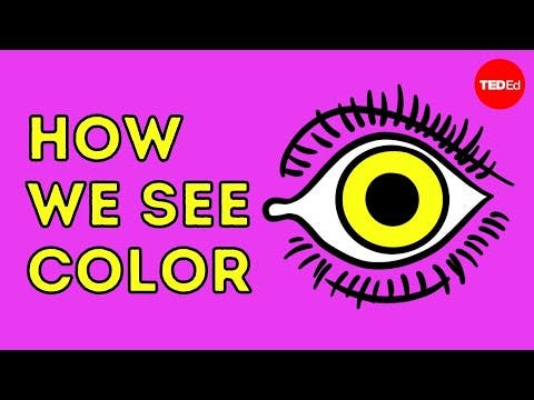
How we see color - Colm Kelleher
Nice explainer of what color is: different wavelengths of light reflected from objects and detected by our eyes and brain.
The Science of Color Perception
This neat video adds a bit more detail about color perception. We carried the "cones" characters into our original video (next in the playlist).
How do we know what a fish likes? (And can we predict it?)
Follow in the footsteps of Drs. Tamra Mendelson and Tory Williams! Explains basics of how color vision works in humans and fish.
Creature Stats Character Sheets
Students will use these designs to to test a novel hypothesis about what makes something creepy or cute.
Darter facts: the colorful little fish | Animal Fact Files
More Details on Darters (for Part 2). Supplement–not included in any lesson materials.

3 x ~65 min
Part 1 will likely take ~80 min with a typical group of middle schoolers, while we expect Parts 2-3 could be done in an hour. With older or more advanced students, each part may go more quickly.
Available Grade Bands
Available Teaching Environments
Learning Objectives
Students will be able to...
Follow the scientific method to solve a real world problem.
Analyze how thoughts and emotions affect decision-making and responsible behavior.
Demonstrate understanding of perception, cognition and emotion in the context of research through written and verbal explanations.
Materials for
Presentation (Part 1)
Need: WiFi, Computer, Projector, Sound
Image Handout for Student Experiment (Part 1)
Print Class Set for Each Group (Pair of Students)
Student Worksheet (Part 1)
Print 1 Per Student
- For teachers guides, sign in with a free account!
Teacher Worksheet (Part 1)
Print 1
Steps & Flow
5 min: Getting Started
5 min: Getting Started
1.Puzzle Warm-Up
Puzzle Warm-Up
1.Puzzle Warm-Up
Puzzle Warm-Up
What question are we investigating?
Students interpret a series of images (rebus puzzle) to determine the focus of this lesson. Their answers are recorded on the "I Like That" Part 1 worksheet.
2.Scientific Method
Scientific Method
2.Scientific Method
Scientific Method
Quick refresher of the scientific method
This lesson is a real experiment and the results are specific to each class that completes it. This is exactly what scientists face in their own labs when they ask questions that don't have answers yet. Because this requires students to have a solid understanding of the Scientific Method, the first part of the lesson is a recap of each step in that process.
10 min: Observation
10 min: Observation
3.Ranking Images
Ranking Images
3.Ranking Images
Ranking Images
The Image Cards present a set of ten images to the students which they must rank from favorite (#1) to least favorite (#10) on their worksheet (Qs 1-10).
Students have five minutes to complete this activity. Their observations form the basis for the next part of the scientific method. Students need either digital or printed copies of Images A - J (Image Cards) as well as the "I Like That" Part 1 Worksheet.
Try to save the Image Cards and laminate them or put them in protective sleeves if you plan to teach the lesson multiple times.
10 min: Question
10 min: Question
4.Watch Video 1
Watch Video 1
4.Watch Video 1
Watch Video 1
The next step after collecting observations is questioning why they are the way they are.
By talking about visual stimuli, students understand why they ranked the 10 images the way they did. ▶ I Like That! How our eyes and brains interact to determine what we like and dislike explores how the eyes and brain interact to result in our visual preferences.
- stimulus: something that causes an organ or tissue (like your brain) to react (plural is stimuli)
5.Check In
Check In
5.Check In
Check In
Students next consider how Cognition, Perception, and Emotion of visual stimuli influenced their observations.
After watching the video and learning more about the Cognition, Perception, and Emotion triad, students answer Questions 11-15 on their worksheets.
- cognition: how well you understand what you're perceiving
- perception: our ability to see, hear, or become aware of a stimulus through our senses
- emotion: a positive or negative feelings brought about by chemicals released in the brain
- preference: whether you like or dislike something which is influenced by a combination of cognition, perception, and emotions
10 min: Hypothesis
10 min: Hypothesis
6.Developing Hypotheses
Developing Hypotheses
6.Developing Hypotheses
Developing Hypotheses
The next step in the scientific method is to develop a hypothesis that can be tested which gets at the "Why."
The class tests the hypothesis that cognition and emotion determine how the images were ranked.
7.Setting Up Experiments
Setting Up Experiments
7.Setting Up Experiments
Setting Up Experiments
To determine whether the hypothesis can be rejected or accepted with confidence, the group sets up an experiment.
The experiment must try to isolate two of the three effects (Cognition and Emotion) and measure how much each contributes to preference.
8.Think - Pair
Think - Pair
8.Think - Pair
Think - Pair
Using descriptive numerical scales, students discuss in pairs (or small groups) how they would rate their top-ranked images based on Emotion and Cognition.
Throughout the lesson, you will occasionally see Think - Ink - Pair - Share, or some combination thereof, on the presentation slides. The words not grayed out are the goals for that activity. Think means a student considers a question or challenge on their own, Ink indicates they should be writing their thoughts or answers down, Pair asks that once they have completed Think and/or Ink, students pair up (or get in small groups) and talk about the question or activity. Lastly, Share is when the class comes together and talks about the question or activity as a group.
10 min: Prediction
10 min: Prediction
9.Creating Predictions
Creating Predictions
9.Creating Predictions
Creating Predictions
Think - Ink - Pair
Students learn how to develop predictions related to their hypothesis and experimental design by looking at example data. They have two minutes to think about the example presented to them and decide which responses they would predict. Students then discuss their answers in pairs or small groups.
10.Adopting a prediction.
Adopting a prediction.
10.Adopting a prediction.
Adopting a prediction.
Once the class understands how to formulate a prediction, for the purposes of this study they adopt the following Prediction (P1): Top ranked images will have high cognitive and emotional scores.
20 min: Experiment
20 min: Experiment
11.Collecting Data
Collecting Data
11.Collecting Data
Collecting Data
Working in pairs, students trade off being the "scientist" and "test-subject."
The student acting as the "scientist" shows the "test subject" one image at a time and asks questions using the Cognitive and Emotion Score scales to collect data. Each pair has 10 minutes to complete the experiment, then they switch roles and repeat the process. The scientist should record the test subject's data on the test subject's worksheet (page 4).
10 min: Results
10 min: Results
12.Plotting Data
Plotting Data
12.Plotting Data
Plotting Data
Using the data from the experiment, students plot their results on graphs.
Students plot their data to make similar graphs as the ones used in the example data to practice making predictions. These graphs plot Emotion vs. Cognitive scores for the top and bottom five scores.
5 min: Conclusions
5 min: Conclusions
13.Discussing the Results
Discussing the Results
13.Discussing the Results
Discussing the Results
Based on the class's data, what can be concluded about how cognition and emotion affect how images are ranked?
Students answer questions 9 - 15 on their worksheets. The class can also discuss as a group the results, why they may have ended up with the results that were observed, and how the experimental design may have affected any outcomes.
Learning Objectives
Students will be able to...
Follow the scientific method to solve a real world problem.
Interpret a concept map of how our perception of beauty results from interactions between our brain and sensory systems.
Analyze how thoughts and emotions affect decision-making and responsible behavior.
Visualize data in multiple ways including tables, histograms and boxplots.
Understand how cone cells work in the retina in the eye and how it relates to perception.
Demonstrate understanding of perception, cognition and emotion in the context of research through written and verbal explanations.
Materials for
Presentation (Part 2)
Need: WiFi, Computer, Projector, Sound
- For teachers guides, sign in with a free account!
Teacher Worksheet (Part 2)
Print 1
Student Worksheet (Part 2)
Print 1 Per Student
Steps & Flow
5 min: Warm-Up
5 min: Warm-Up
1.Polymath Puzzle #2
Polymath Puzzle #2
1.Polymath Puzzle #2
Polymath Puzzle #2
How many ladybugs are there?
Students see a set of squares and are tasked with counting how many ladybugs they see. This activity was developed by experimental psychologist, Akiyoshi Kitaoka, who studies visual illusions.
2.Part 1 Review
Part 1 Review
2.Part 1 Review
Part 1 Review
What patterns could be observed?
Students recall their data from Part 1 from the image ranking experiment and whether about whether they noticed any patterns.
- aesthetics: a set of principles concerned with the nature and appreciation of beauty, especially in art.
15 min: The Science of Perception
15 min: The Science of Perception
3.How does the human eye work?
How does the human eye work?
3.How does the human eye work?
How does the human eye work?
The perception of beauty is often influenced by colors which is perceived using our eyes. Students learn more about how this process works in the interface between the eyes and brain.
- perception: the ability to see, hear, and become aware of something through the senses.
20 min: Preferences in the Animal Kingdom
20 min: Preferences in the Animal Kingdom
4.Studying visual signals in fish
Studying visual signals in fish
4.Studying visual signals in fish
Studying visual signals in fish
An introduction to Dr. Mendelson's work with Darters.
Darters are great model organisms to study evolutionary changes in animal communication over time.
- model organism: a non-human species used to study some biological phenomena or process to provide insight into how the phenomena or process works in other species.
5.What a fish likes
What a fish likes
5.What a fish likes
What a fish likes
Students watch ▶ How do we know what a fish likes? (And can we predict it?) which explains more about Dr. Mendelson's work on how fish preference is studied scientifically.
5 min: Analysis
5 min: Analysis
6.Box Plots
Box Plots
6.Box Plots
Box Plots
Think - Ink - Pair - Share
Using actual data from Dr. Mendelson's studies, students consider how visual stimuli and fish perception interact to influence fish preferences (Q3 in the worksheet). They then learn about box plots and how they are used in data analysis.
15 min: Conclusions
15 min: Conclusions
7.Independent Work
Independent Work
7.Independent Work
Independent Work
Students reflect on their findings. This work can be done in class or for homework.
The beginning of Part 3 will include time to discuss take-homes from the analysis. Specifically, which is more important--cognition or emotion--for explaining students' ranked preferences for images?
Learning Objectives
Students will be able to...
Follow the scientific method to solve a real world problem.
Calculate anatomical proportions (e.g. arm length to torso length) and compare to the range of human variation to consider what "normal" or "typical" means statistically.
Demonstrate understanding of perception, cognition and emotion in the context of research through written and verbal explanations.
Materials for
Presentation (Part 3)
Need: WiFi, Computer, Projector, Sound
Student Worksheet (Part 3)
Print 1 Per Student
- For teachers guides, sign in with a free account!
Teacher Worksheet (Part 3)
Print 1
Creature Stats Character Sheets Handout (Part 3)
Print Class Set for Stations or 1 per Student
Steps & Flow
5 min: Warm-Up
5 min: Warm-Up
1.Cute vs. Creepy
Cute vs. Creepy
1.Cute vs. Creepy
Cute vs. Creepy
Quick write-up about how to define cute vs. creepy.
Students write briefly about how they might define something as being cute and creepy. They then look at a line-up of characters and write about which one they find the cutest vs. creepiest and why.
- phenotype: physical appearance
10 min: Typicality
10 min: Typicality
2.Perception and preference affecting familiarity
Perception and preference affecting familiarity
2.Perception and preference affecting familiarity
Perception and preference affecting familiarity
What do we mean when something is called "typical"?
After learning about what typicality means, students apply it to how it can influence preference through our different sensory systems.
- typicality: within certain limits of what is typical, or occurs most often
3.How does "atypicality" influence our preferences?
How does "atypicality" influence our preferences?
3.How does "atypicality" influence our preferences?
How does "atypicality" influence our preferences?
While "typical" things often reflect what we prefer, on the other hand atypical things can cause us to feel repulsed or uneasy. Students use animated characters to dig deeper into this.
4.Form a prediction
Form a prediction
4.Form a prediction
Form a prediction
Students answer Q1-3 on their worksheet to form a prediction about how we percieve what is cute vs. creepy.
15 min: Creature Stats
15 min: Creature Stats
5.Typical and Exaggerated Human Proportions
Typical and Exaggerated Human Proportions
5.Typical and Exaggerated Human Proportions
Typical and Exaggerated Human Proportions
Evaluate the characters
There are seven illustrated characters which have several different measurements for different parts of their bodies. Students use these to calculate different proportions, or ratios, between different body parts, such as eye height to eye width, by finishing Table 1 in the worksheet (Qs4-15). Lastly students mark the ratios on a pre-made histogram (Q16).
Try to save the Creature Stats Character Sheets and laminate them or put them in protective sleeves if you plan to teach the lesson multiple times to save on printed paper.
15 min: How to read this graph?
15 min: How to read this graph?
6.Histograms
Histograms
6.Histograms
Histograms
What is a histogram?
Students go through an example of what a histogram is and how to interpret the data to draw conclusions.
7.Dot Plots
Dot Plots
7.Dot Plots
Dot Plots
Understanding the data
Dot plots use similar data to histograms, but make display the data in a way that's a little easier to understand. Students practice looking at example dot plots and analyzing them for information.
15 min: Results & Conclusions
15 min: Results & Conclusions
8.Data Analysis
Data Analysis
8.Data Analysis
Data Analysis
Drawing conclusions about cute vs. creepy.
Using the histogram data from Creature Stats, students draw final conclusions about how something could be labeled as cute or creepy based on ratios.
9.Discussion
Discussion
9.Discussion
Discussion
Do the data support the predictions?
Students refer back to their predictions and discuss whether the data they collected and analyzed support them.
Please let us know how it went with your class!
We want to know what you (and/or your students) think!
Share your feedback in < 5 min with these forms:
- Have students do independent research on how our sensory sensitivities can bias our decision making. Here are some readings for inspiration:
- Have your students read the scientific paper that Part 2 is based around ( see Background ), and have them grapple with how the version they experienced in class compares to the complexity of the paper. The goal could be to have them try to extract as much meaning from the paper as possible, while not becoming too frustrated.
Connection to Research
In this three-part lesson, students will follow in the footsteps of scientists (analyzing real, published data), but also conduct their own novel experiments. Overall, our hope is that students will recognize that science and data are everywhere and give us insight into ourselves.
Research Background
Parts 1 and 3, students will run their own experiments, testing novel hypotheses related to their own preferences. For these activities, we developed a conceptual framework that is woven into all lesson parts. This framework is explained in our video ▶ I Like That! How our eyes and brains interact to determine what we like and dislike. We want students to understand in general terms how our brains perceive things detected by our senses, and then incorporate prior experience and emotional responses to form preferences that affect their behavior. This is based on research in humans and other animals. Though human "emotions" can be very complex, many animals from primates to bees show a range of positive <-> negative responses to stimuli that can be interpreted as emotions. If students are interested in learning more about emotions in animals, here are some excellent scientific articles targeted at young readers:
- Frontiers for Young Minds | Animal Emotions–Do Animals Feel as We Do?
- Frontiers for Young Minds | Your Smile Caught My Eye: Why Do Emotional Things Catch and Hold Our Attention?
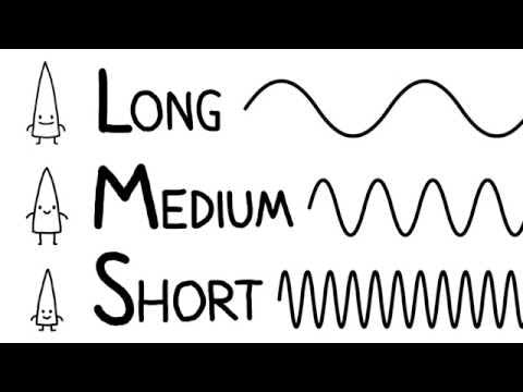
In Part 2, students will learn about how our eyes detect and process different colors (i.e. different wavelengths of light). They learn key background from ▶ How we see color - Colm Kelleher and ▶ The Science of Color Perception.
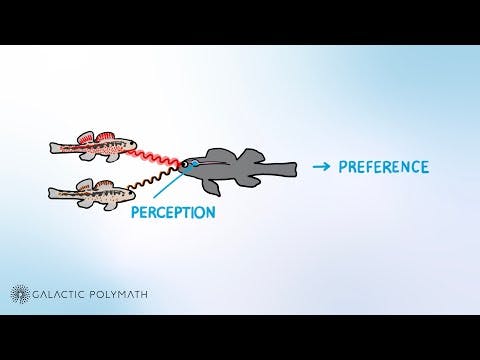
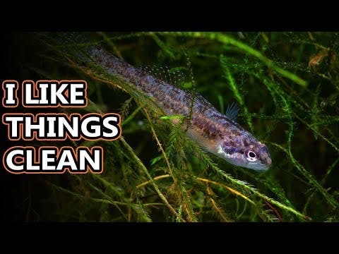
In our original video: ▶ How do we know what a fish likes? (And can we predict it?), Drs. Tamra Mendelson and Tory Williams talk about their work on darters, a fascinating and beautiful group of fish native to North America (see supplementary vid: ▶ Darter facts: the colorful little fish | Animal Fact Files).
In the scientific study students will learn about, the researchers tested whether female darters were most attracted to colors that were most stimulating to the sensory cells in their eyes (i.e. cones found in the retina). Students will follow in the scientist's footsteps, first making predictions and then analyzing their authentic data. The video and presentation will guide students through interpreting graphs of sensitivity curves to make their predictions.
Basically, there were two models of male fish used to test female preferences. They were colored "red" and "orange" to mimic extremes of natural variation. Looking at the graph below, the place where the 2 sensitivity curves overlap is the light wavelength that should be most stimulating to females' eyes. That is, light that has a wavelength of about 550nm should maximize activation of both the medium and long wavelength cone cells in the retina. The question is: do females prefer a model with an average reflectance closest to this wavelength?
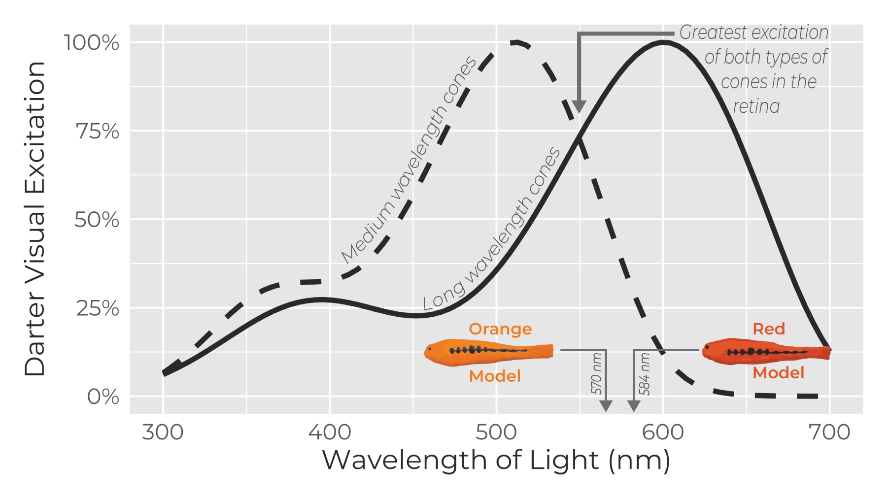
The video and presentation guide students through interpreting this graph—to predict that females should prefer the orange model. Our video explains the experimental setup, but here it is briefly: Individual wild-caught females were put in the middle of a tank which had two tanks on either side of it. Model fish simulating extremes of natural variation in male colors were placed on either side of the female tank. An observer recorded what proportion of time females spent associating with the "red" versus the "orange" male model. Students will observe the patterns in the data and determine that females had a strong preference for the orange model. They will then draw conclusions about why this research matters more broadly and hopefully begin to wonder--how are our daily decisions affected by our sensitivity to different stimuli? This could be a great jumping-off point for independent research/PBLs. See Extensions
Target Standard(s)
Dimension:Science & Engineering Practices
How does the lesson address this standard?
In part 1, students investigate the researcher's concept map through experimentation.
How does the lesson address this standard?
Throughout all 3 parts of the lesson, students are given multiple opportunities to think-pair-share, have structured classroom discussions, and work with groups to gain understanding.
How does the lesson address this standard?
Throughout the lesson, students follow the scientific method to deepen their understanding of how perception, cognition, and emotion affect our preferences and decision making.
How does the lesson address this standard?
In Part 3, students will create ratios from character sheets to calculate proportions of different character's body proportions (e.g. arm-length / torso-length) and round to the nearest hundredth.
How does the lesson address this standard?
In Part 3, students will create ratios from character sheets to calculate proportions of different character's body proportions (e.g. arm-length / torso-length).
How does the lesson address this standard?
In part 1, students are asked to explain the concept map via an example in their own lives.
How does the lesson address this standard?
Students will be encouraged to ask questions and share understanding as they develop an understanding of a conceptual model (concept map) of visual processing in the brain.
How does the lesson address this standard?
In Part 1, students will conduct an experiment to understand their own visual preferences and generate graphs of the classroom data. They will then interpret these findings to test a hypothesis. In Part 2, students similarly analyze a real scientific figure. In Part 3, they again collect data, this time based on anatomical ratios in character design sheets. In all cases, there are opportunities for students to share their ideas, observations and reflections.
Dimension:Disciplinary Core ideas
How does the lesson address this standard?
Part 2 focuses on specialization of cones in the eyes of humans and fish (darters) to detect different wavelengths of light.
How does the lesson address this standard?
Visual perception of color is the focus of Part 2. Students will gain a quite detailed understanding of how color is perceived, how visual sensitivity can directly affect preference, and over all parts, how perception, cognition, and emotion, affect preferences and behavior.
How does the lesson address this standard?
In Parts 1 and 2, students will gain a deeper understanding of how visual sensing of color and patterns affect what we can actually perceive, and how perception is affected by our emotions and cognition (memory and higher order thinking) to drive our preferences. This will involve a good amount of background about how we perceive color (i.e. that color refers to different wavelengths of light that are detected by cones in the retina).
Dimension:Cross-Cutting Concepts
How does the lesson address this standard?
- In Part 1, students will generate predictions based on graphs, and create their own graphs based on collected data to test their predictions.
- In Part 2, students will interpret a table and a box plot graph (similar to a bar plot) to test a scientific hypothesis, retracing a published scientific paper.
- In Part 3, students will plot points on a number line and compare to a histogram showing the range of human variation.
How does the lesson address this standard?
In part 2, students learn how the function of the cells of the eye affect preception.
How does the lesson address this standard?
Throughout all 3 parts of the lessons, students use terms perception, cognition and emotion to explain the concept map.
How does the lesson address this standard?
Throughout all parts of the lesson, students will keep returning to a conceptual framework (concept map) of visual processing in the brain. With each Part, they will gain new insights and understanding about how the eyes (visual sensory systems) interact to affect perception, cognition, and emotion, and how these in turn affect preferences in humans, fish, and other animals.
Connected Standard(s)
Dimension:Number Systems, Operations & Abstract Representation
How does the lesson address this standard?
In Part 3, students will calculate proportions of different character's body proportions (e.g. arm-length / torso-length) and round to the nearest hundredth.
How does the lesson address this standard?
In Part 3, students will calculate proportions of different character's body proportions (e.g. arm-length / torso-length) and round to the nearest hundredth.
How does the lesson address this standard?
In Part 3, students will create ratios from character sheets to calculate proportions of different character's body proportions (e.g. arm-length / torso-length) and round to the nearest hundredth.
How does the lesson address this standard?
In part 1, students plot their top and bottom ranked images into a graph.
How does the lesson address this standard?
In all 3 parts, students will analyze real data (collected by themselves through novel experiments or from published research). This will involve calculation of proportions, adding up results, and higher-order data interpretation.
How does the lesson address this standard?
In Part 3, students will calculate proportions of different character's body proportions (e.g. arm-length / torso-length) and round to the nearest hundredth.
Dimension:Measurement, Data, Probability & Statistics
How does the lesson address this standard?
In part 3, students work with histograms and box plots that show the spread and distribution of data points.
How does the lesson address this standard?
In part 3, students are given histograms that show the variabilty in human proportions and asked to plot the proportion values for different creatures to notice any deviations.
How does the lesson address this standard?
In parts 2 and 3, students interact with box plots and histograms respectively.
How does the lesson address this standard?
In part 3, students are given histograms that show the variabilty in human proportions and asked to plot the proportion values for different creatures to notice any deviations.
Dimension:Reading
How does the lesson address this standard?
In parts 1 & 3, students follow a procedure to conduct the experiment with their classmates and collect data.
How does the lesson address this standard?
In part 1, students convert their emotional and cognitive responses into numerical scores that they enter into a data table and analyze.
How does the lesson address this standard?
In Parts 1 and 2, students will interpret data collected by their classmates and real scientists (respectively), presented in tables and graphs. They will analyze and reflect on their findings.
Dimension:Language, Speaking & Listening
How does the lesson address this standard?
In this lesson, students will acquire and use several new vocabulary terms (e.g. cognition, perception, cones, etc.). The terms are explained in context through readings and videos and students are given opportunities to incorporate the new terms into exercises and discussion.
Dimension:Writing
How does the lesson address this standard?
In Parts 1 and 2, students will interpret data collected by their classmates and real scientists (respectively), presented in tables and graphs. They will analyze and reflect on their findings.
How does the lesson address this standard?
In part 1, students convert their emotional and cognitive responses into numerical scores that they enter into a data table and analyze.
How does the lesson address this standard?
In part 2, students view representative data from the scientists' research and view videos of the scientists explaining the research to explain the results.
Dimension:Science & Engineering Practices
How does the lesson address this standard?
Throughout the lesson, students are encouraged to ask questions about themselves: why do I like x or y, but not z? They also interrogate the model of visual processing in the brain as they learn how perception, cognition, and emotion affect preferences in humans and fish, in different contexts.
How does the lesson address this standard?
Throughout, students will build on and refine their understanding of a conceptual model for visual processing in the brain.
How does the lesson address this standard?
In all 3 parts, students will ask questions, make hypotheses and/or predictions, and test the predictions with real data.
How does the lesson address this standard?
In all 3 parts, students will ask questions, make hypotheses and/or predictions, and test the predictions with real data.
How does the lesson address this standard?
In part 1, students are asked to explain the concept map via an example in their own lives.
How does the lesson address this standard?
In Part 2, students will analyze a box plot to test whether female darters (fish) spent more time near one of two experimental model fish. (See Background)
How does the lesson address this standard?
In Part 3, students will create ratios from character sheets to calculate proportions of different character's body proportions (e.g. arm-length / torso-length) and round to the nearest hundredth.
How does the lesson address this standard?
In part 1, students investigate the researcher's concept map through experimentation and data collection. In part 3, they conduct a separate investigation into what is 'creepy' vs 'cute' based on comparing character design dimensions to the range of natural human variation.
How does the lesson address this standard?
Extension: See links in the Extensions and Background sections for scientific articles that you can read and analyze with your class after you have taught the lesson.
Dimension:Disciplinary Core ideas
How does the lesson address this standard?
We do not go into detail about body systems and subsystems, though this is an implicit take-home.
How does the lesson address this standard?
Though the terms frequency and amplitude are not introduced, the we refer to different wavelengths of light throughout Part 2 in particular. This is explained in one of the videos in Part 2.
How does the lesson address this standard?
In Part 2, multiple connected videos explain how reflected light is perceived by the eye as different colors, depending on the degree certain wavelengths of light excite different cone cells in the retina.
How does the lesson address this standard?
In Part 2, students get a crash course in color and color perception in humans and fish.
Dimension:Cross-Cutting Concepts
How does the lesson address this standard?
Through the conceptual framework of visual signal processing, students will become very familiar with the connections between the eyes and different aspects of neural processing (though we don't go into the specific parts of the brain, which is a bit beyond the scope of this lesson).
Dimension:Performance Expectation
How does the lesson address this standard?
In Parts 1 and 2, students will gain a deeper understanding of how visual sensing of color and patterns affect what we can actually perceive, and how perception is affected by our emotions and cognition (memory and higher order thinking) to drive our preferences. This will involve a good amount of background about how we perceive color (i.e. that color refers to different wavelengths of light that are detected by cones in the retina).
Dimension:Self Awareness & Self Management
How does the lesson address this standard?
'How Aligned' not yet documented.
Dimension:Social Awareness & Relationships
How does the lesson address this standard?
'How Aligned' not yet documented.
How does the lesson address this standard?
'How Aligned' not yet documented.
How does the lesson address this standard?
'How Aligned' not yet documented.
Dimension:Responsibility
How does the lesson address this standard?
'How Aligned' not yet documented.
How does the lesson address this standard?
'How Aligned' not yet documented.
Lesson Authors:
Animation and Storyboarding
Education Consultant:
Sponsor and Producer
Please sign up for our mailing list to hear what’s coming up next!
Scientific Advisory
Helped devise conceptual framework & lesson structure
- Julien Renoult, PhD | Tenure CNRS Research Scientist, Center for Evolutionary & Functional Ecology Montpellier, France
Featured Scientist
- Tory Williams, PhD | Research Associate, Department of Education University of Maryland, Baltimore County
Data Provider
For Part 2: The Perception of Beauty
- Jenny Gumm, PhD | Fish Biologist & Facility Manager,, Ash Meadows Fish Conservation Facility
Beta Tester
Ran the lesson in class and recommended changes
- Kenton Wesby, EdD | STEAM Teacher (grades 6-8), Isaac Litton Middle School Nashville, TN